#02 Weekly market update (27/09/2021 - 01/10/2021)

Weekly performance:


Key takeaways:
Economic calendar: All eyes on next week’s economic calendar. Nonfarm payrolls, Jobless claims, US Manufacturing & Services PMI and the OPEP+ meeting will play a crucial role in next week’s financial markets performance.
Macroeconomic outlook: “Stagflation” has been the most popular word of the week. Rising PCI levels across Europe combined with weak consumer sentiment data have led to revised growth projections. Peak GDP & EPS suggest low/negative stock/credit returns.
Quantitative levels: $4,365 as the new flip-dealer point. Last Friday S&P500’s high coincided with that point. S&P500 closed at $4,343.
Equities: Decreasing trading activity by retail investors. The number of new Robinhood app downloads is down 78% from 2Q2021 and daily active users have declined -40% from 2Q21. Increasing share repurchase black-out period throughout October.
Energy crisis: Winter is coming. Energy prices exponentially increasing, disrupting the industrial sector and forcing factory closures, anticipating supply shortage. Policy makers exploring energy saving measures.
Fixed Income: US 10Y note 200 SMA, a crucial level. Widening US 2Y-10Y spread, sending warning signals on economic deceleration.
Emerging Markets: Worst quarter for Chinese equities since 2001. The uncertainty on Evergrande collapse remains high. The company has missed bond payments to overseas investors. PBoC keeps injecting liquidity.
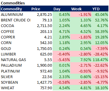
Commodities: Bullish week for commodities. BofA spots unsual correlation between commodities and USD. Morgan Stanley says silver might be a better inflation hedge than gold.
Draining liquidity but… no fear yet
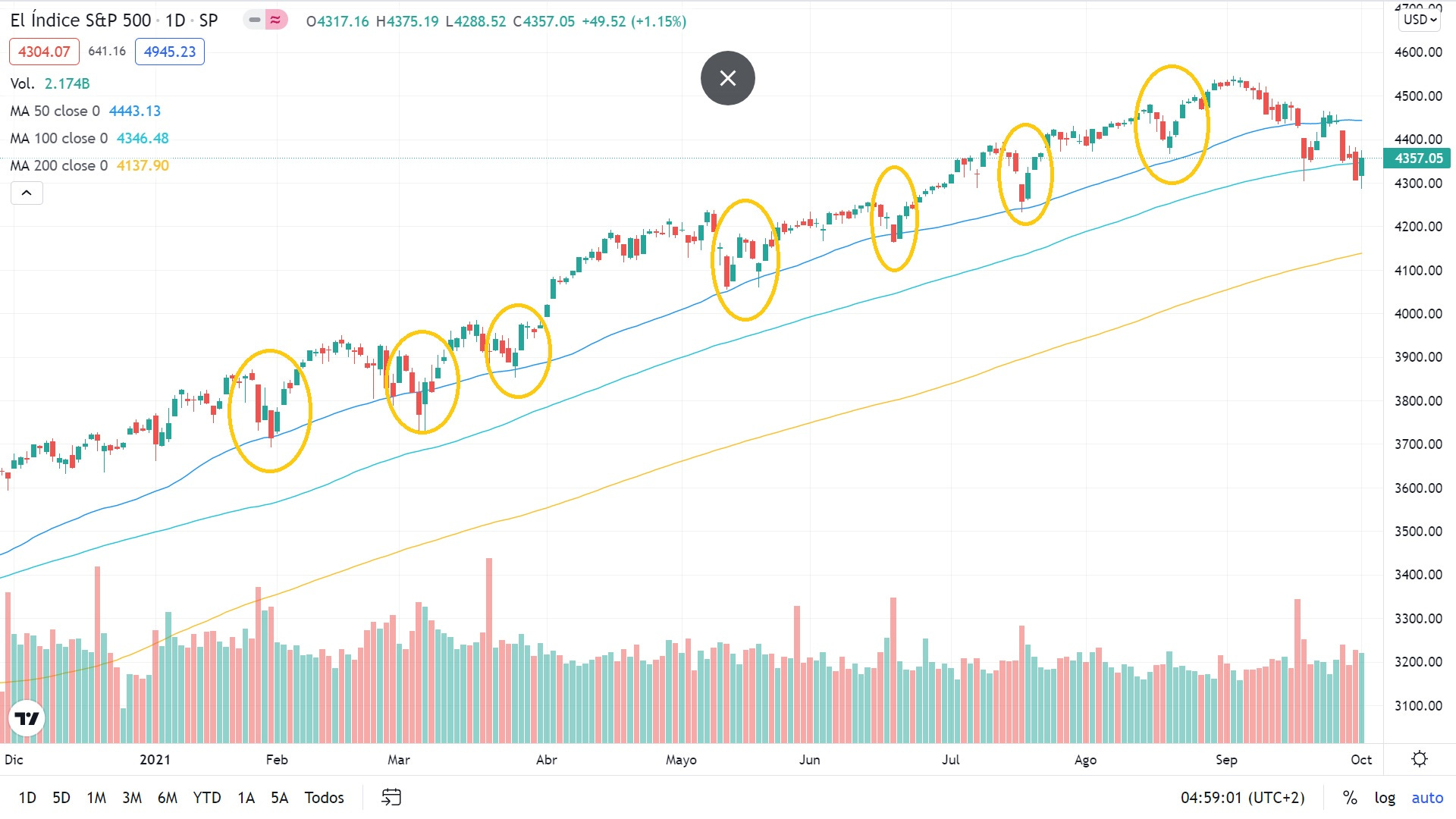
By having a look at the technical chart of the S&P500 (Graph 1), we can easily identify a pattern: Every time the 50 SMA has been tested, the index has been able to rebound preventing it from losing its technical support level. As a matter of fact, these dates correspond to the options expiration dates, which takes place the third Friday of the contract month.
Graph 1: S&P technical chart
Graph 2 shows the S&P500 Index level this year with monthly option-expiry dates overlaid. In each of the months, market drawdowns have closely coincided with expiry dates. The underlying reason for this relationship is due to the fact that option trading has become more popular over the last few years and its share of total volume has increased in the recent months (Refer to Graph 3, especially by retail investors, whose favourite trade is buying OTM calls. Normally, these calls tend to expire in the very short-term. This implies the expected return of these trades resembles that of a casino roulette bet: “low probability, high payoff”. Back to the S&P500 technical chart, we can see this time the S&P has not been able to rebound on the 50 SMA.

Graph 2: S&P500 with monthly option expiry dates

Graph 3: Calls/Puts average trading volume (in millions)
While correlation does not mean causation, we can identify two main liquidity issues conditioning the S&P500 performance. First, we are in the beginning of a share repurchase blackout period. Graph 4 shows the percentage of companies in the S&P500 bound to blackout. As we can see, this period will be progressively increasing until mid-October, when the share repurchase restrictions will start easing. The second factor conditioning the liquidity of the S&P500 is the decrease in trading activity by retail investors. In the last months, it was retail investors who propelled the S&P500. Nevertheless, according to JPMorgan, the number of new Robinhood app downloads is down 78% from 2Q2021 and daily active users have declined -40% from 2Q21.
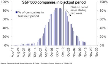
Graph 4: S&P 500 companies in blackout period
The S&P500 has dropped 5% in September, registering its worst monthly performance since March 2020. Investors have an eye on the treasury yields in order to figure out how will equities perform October onwards. From the tables above, we can see a clear trend throughout this week: Equities have gone down while Treasuries’ yields have gone up. Influenced by the US debt ceiling, the massive infrastructure deal and the Evergrande Group collapse, US Treasuries have reached a three-month high.
If we analyse the US 10Y note price technical chart (Refer to Graph 5), we can see the 200 SMA is a crucial level. This week increase in yields has made prices to fall below the 200-day moving average. As a result, equities have perceived this signal and have had a negative week in terms of performance. Were treasuries to reach the 200 SMA again, two scenarios unfold. The first one is that 200 SMA is not broken, and the failed rebound makes prices decrease further. This would spread a contagion effect to equities, which may replicate the underperformance. The least pessimistic scenario is that the 200 SMA level is broken. As a result, equities may be positively affected and may follow on the upward trend.

Graph 5: US 10Y Technical chart
A relevant indicator for institutional investors is the US 2Y-10Y spread (See graph 6). The last week’s surge in US 10Y yields has widened the abovementioned spread warning investors about a possible economic deceleration. According to historical data, a spread between 0 and 150 is considered to be a “sweet spot” for equities, where S&P500’s average annual return in this range has outperformed overall average historical performance (11% vs 9.1%). As of yesterday the spread was 120 basic points, suggesting a closer level to the 150 basic points, a threshold where historical returns tend to be low.

Graph 6: 10-Year Treasury Constant Maturity Minus 2-Year Treasury Constant Maturity
The increase in yields has been triggered by the Fed’s hawkish posture during last week’s meeting. The Fed announced the possible starting date of the tapering, through which they would stop its 120 billion purchases of Treasuries from November onwards and, as a result, interest rates may be raised sooner than expected. The starting of the tapering would stop liquidity flowing into the market. In graph 7 we can see how the S&P500 performance has been following the global money supply. Next Friday, September’s nonfarm payrolls data will be released. This means that it will be the last official employment data before the Fed meeting taking place in November. As Jerome Powell stated, they would initiate tapering if employment data is decent. According to Reuters, 500,000 jobs are expected to be added. This implies that stronger employment data than expected may cause further market turmoil by anticipating a Fed hawkish response.

Graph 7: Global Money Supply vs. S&P 500
It is worth mentioning that markets do not have technical indicators which show fear yet. By checking the VIX Futures Term Structure (Refer to Graph 8), we can see the structure of the VIX expiration follows contango. Recall we define contango when a futures curve is upward sloping from left to right. Contango occurs the vast majority of time, which is due to the skewed and mean reverting nature of the VIX and volatility in general. When the curve shifts toward backwardation, it is a clear fear signal to markets.

Graph 8: VIX Futures Term Structure
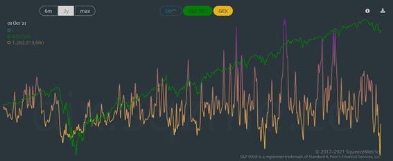
Another clear signal that reinforces the lack of fear in the market is the dark pool index (See graphs 9 and 10). Dark pools are private exchanges which facilitate block trading for institutional investors who do not want to impact markets with their large orders. As it is not accessible by retail investors, this infographic only contains trading activity by institutional investors. This interactive tool has three vertical axes. While the green line tracks the S&P500 performance, the blue line represents the aggregated dark pool indicators of the S&P500 Index. Thus, it measures market sentiment from the point of view of dark liquidity.
The interpretation of DIX is simple: When it goes up, implies institutional investors are buying and otherwise. GEX refers to the gamma exposure or, said in other words, the sensitivity of existing option contracts to changes in the underlying price. It is worth mentioning that substantial imbalances may occur between market makers’ call-and-put option exposures. When this takes place, the effect of their hedges can either accelerate price swings (e.g. squeeze) or stifle the movement entirely. Back to the dark pool, we can see how institutional investors have kept on buying while the S&P was falling. With regards to GEX, this week a historical low has been reached. The last precedent took place on March 4th 2021. An extreme low GEX is a clear indicator of an extreme rebound. As a matter of fact, a bull run initiated on March 5th 2021.

Graph 9: Dark Pool - DIX vs S&P 500
Graph 10: Dark Pool - GEX vs S&P 500
When it comes to the flip-dealer point, SpotGamma has recently released their new calculations referring to $4,365 on S&P500 E-mini as the new flip-dealer point. This point identifies the level at which gamma changes from negative to positive. Negative gamma (current scenario) tends to bring about overreaction on financial markets. This means the velocity of both gains and losses is high. This overreaction is slowed down when gamma becomes positive. Actually, Friday’s session high coincided with the flip-dealer point.
Finally, Charlie McElligott from Nomura released a paper on Friday stating we currently find ourselves in the late stages of the selloff. He expects increased reduce in volatility in the coming days if i) Accelerant flow risks from Dealer “short Gamma” are cleared, and ii) CTA deleveraging triggers selling points are not activated.
Graph 11 shows the CTA deleveraging triggers (new prices), which correspond to institutional investors’ selling points. Being 100% long on S&P500, the last week’s selling level was $4,260. As they rely on closing prices, the selling point was not triggered. This week, they still remain 100% long on most of the indexes. It is worth mentioning all selling levels correspond to the spot (not the future). As for NASDAQ, the selling level is 14,513.1. Nevertheless, as they are 37% long on DAX or Russell 2000 indices, this implies that buying levels are more relevant instead. Overall, McElligott considers sell-off to end if and only if none of these selling levels are executed.

Graph 11: CTA Selling points
Stagflation and energy crisis
Some weeks ago, George Saravelos (Global Head of FX Research at Deutsche Bank) published an outstanding paper on the negative supply shock we are currently experiencing. The increasing inflation combined with the decreasing growth suggests we are heading towards stagflation. (See Graph 12) Following microeconomic theory, an increase in inflation combined with a decrease in growth is a byproduct of a negative supply shock. This brings about a left shift on the supply curve. Said in other words, real yields have declined more than inflation expectations have surged, which implies lower nominal yields.
An increase in inflation implies hawkish central banks. Yet, inflation has always been positively correlated to growth, something which makes the central bank response not that obvious. Were central banks to raise rates, the shock in growth rates would be even worse. As a result, tapering would compound the economic slowdown. This could explain the constant “transitionary” message signals central banks have been lately sending to the markets, suggesting their preference for accommodating rather tan responding to the supply shock.
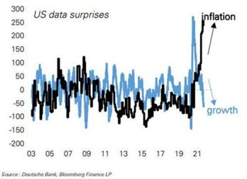
Graph 12: US data surprises - Inflation vs growth
Clearly, the energy sector is the most affected by inflationary pressures. Brent oil prices have reached new highs since October 2018. A faster fuel demand recovery from Delta variant as well as the impact of Ida’s hurricane on supply, has led Goldman Sachs to raise its forecast for year-end Brent crude oil prices to $90 per barrel (from $80). JPMorgan updated its forecast to $84. BofA is the most bullish expecting the crude surpass the $100 level. In the UK, gas stations are running out of gasoline as a result of a shortage of truck drivers. As a result, Boris Johnson decided to expedite temporary visas to foreign truck drivers in order to cope with the situation.
Gas and electricity price surges are disrupting the industrial sector by forcing many manufacturers to reassess their production plans. Accounting for increases of 300 and 100% in Europe and the US, respectively, natural gas prices have skyrocketed as a result of a combination of factors. First, there has been a long winter drove demand during key periods when gas supplies are normally refilled and stored for the winter. Second, cargoes of liquefied natural gas (LNG) have been redirected from Europe to Asia, bringing about a lower than expected LNG output. Finally, Russia, a key exporter of gas, the reduced supplies to Europe (See graphs 13, 14, and 15). One of the most affected countries is the UK, a net importer of power from France and Ireland. This shortage is taking its toll on business activity. While many companies are going bankrupt, others are opting for short closures to benefit from not only energy cost cutting but also increasing the price of their products.

Graph 13: European Natural Gas Prices

Graph 14: Gas and electricity market prices in Spain

Graph 15: German year-ahead power price
In China, where PPI has reached 9.5% in August, electricity crunches have reduced aluminium and cement production. In order to cope with the situation, Beijing has started electricity rationalization plans given the shortage of coal as a result of increased security measures in Chinese mines. Consequently, this decrease in coal production has led to an increase in its price, accounting for +80% YTD. Given Beijing regulates electricity prices, coal power plants in China have not been able to cope with the increasing cost of coal and they are forced to shut down. According to Goldman Sachs, around 44% of the industrial activity in China will be affected.
Semiconductor shortages are also playing a crucial role in the performance of the industrial sector, especially automotive and consumer technology. Companies like General Motors, Ford, Apple or Intel are experience bottlenecks on their manufacturing processes. Manufacturing a chip typically takes more than three months. Nevertheless, semiconductor shortages are delaying the manufacturing time and hence, significantly cutting output. As a response, companies are getting rid of part of their employees to compensate for the loss derived from idle hours. On top of that, logistics and shipping difficulties are worsening the situation. By having a look at Graph 16, we can appreciate the increase in anchored containerships in one of the busiest ports worldwide. As a result, the average cost of shipping a standard large container has increased fourfold with respect to last year. (See Graph 17)

Graph 16: Ports of Los Angeles and Long Beach anchored containerships

Graph 17: Global container-freight costs
Emerging markets influenced by Chinese turbulence
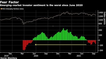
From graph 18 we can see that emerging markets have experienced its worst month since June 2020. The composition of this ETF is as follows: China 33.94%; Taiwan 14.82%; South Korea 13%; India 11.66%; Brazil 5% and Other 21.58%. The negative monthly performance of the index has been mainly affected by the drawdown experienced by Chinese equities, which have experienced its worst quarter since 2001 (See graph 19). According to UBS, they expect MSCI Emerging Markets ETF to be influenced by the hypothetical Evergrande default for the next six months. Nevertheless, they remain bullish on the ETF forecasting an increase of 6-9%.
Graph 18: MSCI Emerging markets ETF performance

Graph 19: MSCI China Index ETF performance
As of today, the collapse of Evergrande remains uncertain. This week the company has missed coupon payments to overseas investors. Citi has recently published its views on the situation (See graph 20). It is worth mentioning that while some broad market volatility is expected, US sectors are not overly at risk. Apparently, there is no evidence US banks have direct exposure to Evergrande, and only a few institutions have modest exposure to China overall.
Overall, Citi concludes its paper considering a managed restructuring as the most probable outcome. This would imply the intervention of the Chinese government to preserve social and financial stability and act in Chinese citizen’s best interest. The debt would be restructured at the holding company level and main shareholders would be replaced. The contagion effect would be limited suppliers and banks. Moreover, home price pressures would go downward in tier 3 and tier 4 cities. Under this scenario, GDP would still grow at 4.9%. The two other scenarios considered by Citi would be a bailout (low probability) or a collapse (very low probability). In the worst-case scenario, GDP projections would be around 3%.

Graph 20: Citi’s analysis on Evergrande
On commodities
In his last paper published on Friday, Michael Hartnett from BofA highlighted an unusual positive correlation between commodities and the USD. Normally, commodities and the greenback tend to be negatively correlated. 2000 was an exception (24% and 8%, respectively). Surprisingly, 2021 YTD is also breaking the norm (See graph 21). BofA describes silver as “a metal important for future technologies (MIFT)”. They remain bullish given the current focus on decarbonisation/solar panels should support fundamentals. Silver is currently -15% YTD.

Graph 21: Commodities and USD annual performance
Disclaimer: I have done my best to ensure that the information provided on this newsletter is accurate and provide valuable information. Nevertheless, the content is used for illustrative purposes only and does not constitute investment advice.
Before you leave…
I kindly welcome your feedback/suggestions/critics, etc to improve the usefulness of it to you. You can reach me at jramos@u.nus.edu. If you would like to receive the newsletters as they are published please subscribe. I also appreciate if you share it with your friends who are interested in this space. Thank you.